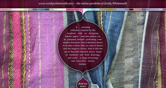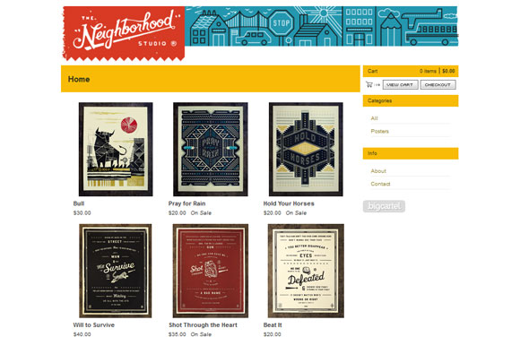
sym-me-try: beauty based on or characterized by such excellence of proportion (dictionary.com)
Symmetrical design relies on principles of balance, rhythm, proportion and unity to create a style with mirroring sides. Symmetry happens when the composition of design is distributed evenly around a central point or axis. This symmetry can be horizontal, vertical or radial in form.
But symmetrical design is not always identical design.
Perfect symmetry occurs when two sides of an item can be folded together to form half of a single object or shape. (Think about folding a circle. The halves will meet perfectly in the resulting semi-circle.)
Objects can have approximate symmetry as well. This is more prevalent than you might think and can be a great design tool. Here we look at different types of symmetry and how they can be used effectively.
Natural symmetry
Symmetry is a naturally-occurring phenomenon that reaches into mathematics and physics, design, architecture and nature.
Many animals are symmetrical by design, as is the human body (but not the internal organs). Think about objects that have two matching sides as having horizontal symmetry – butterflies, daisies, leaves, a dog’s face. Because of its connection to nature and the human form, using symmetry can create a sense of harmony and balance.
Symmetry is static by design and creates order, unity and form. The look and feel is soothing and can be a good design technique when you are creating a site that tries to capture that mood. The biggest downfall to a symmetrical design scheme is that it can sometimes be difficult to create a sense of dominance or really emphasize a single dominant element.
The opposite of symmetry is using asymmetrical techniques – where sides are uneven and break the naturally-occurring balance that comes with symmetrical design. Asymmetrical design can case feelings of confusion or provoke thought. The technique is often used to create a focal point.
There is not right or wrong to designing using symmetry (or not). Some sites will even mix elements of each in the formation of the big picture. Symmetry is best used when you want to maintain a consistent design style that spans across multiple elements, pages or websites. The focal point in a symmetrical design scheme is often the center, but keep in mind how the eyes will move across an object based on the rule of thirds.
Horizontal symmetry
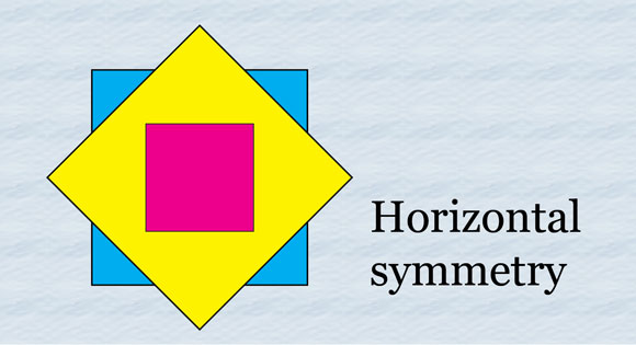
Horizontal symmetry is often the easiest to spot. Look at an item. Draw a line through the center from top to bottom and if the sides form the same outline, the object is horizontally symmetrical.
Keep in mind that the content within the mirroring shapes can be somewhat different or the same.
Think of a dog’s face. The shape will have an almost perfect symmetry but the coloring on each side of the face may be slightly different. (Some purists will argue that and change in color or form results in approximate symmetry, but for design purposes here shape is the key factor.)
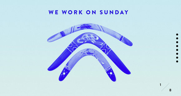
You can apply this symmetrical technique to your design as well by creating a certain shape and filling it with different items, such as the We Work on Sunday site.
Approximate horizontal symmetry
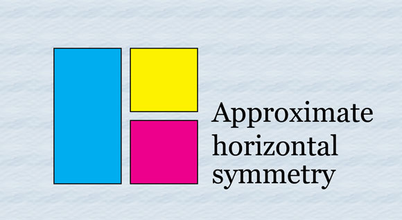
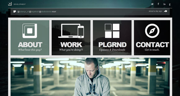
Approximate horizontal symmetry may be the most common form of symmetrical design. It is based on the principle of horizontal symmetry but items do not have to half perfectly. Sides of a form may be slightly different in shape or size.
Adding an element of approximate symmetry rather than perfect symmetry can add a little intrigue to your work. It creates an element of surprise as the eye is drawn to the thing that is different in the slightly off-balance design.
Radial symmetry
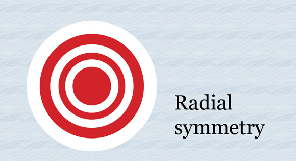
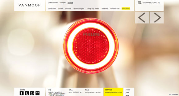
Radial symmetry occurs when an object is symmetrical around a center point. You could half the object or design from any place for a mirror image. (Think about a bulls-eye.)
Radial symmetry can create the most distinct sense of harmony but can be hard to replicate in many design arenas. The shape of your screen – computer, tablet or phone – is likely rectangular, eliminating the possibility of creating a perfectly radial design. Almost all designs using a radial symmetry technique are circular or square in form.
Vertical symmetry
Vertical symmetry is the counterpart to horizontal symmetry. Rather than basing the center point from top to bottom, it is created from left to right; if the top and bottom halves mirror, the design is vertically symmetrical.
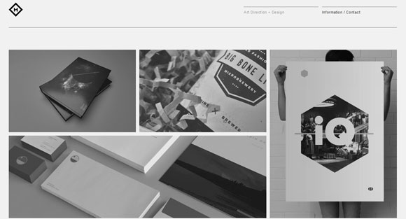
Vertical symmetry is most commonly used when grouping rows of similar elements. This tactic is especially popular for photography and portfolio websites, such as that of Ryan M. Stryker.
More and more, this technique is being used to move users from one screen “fold” to the next on websites. The site is design in such a way that each new “screen” fits perfectly to the computer screen aspect ratio for new views each time you scroll to a new page.
Color symmetry
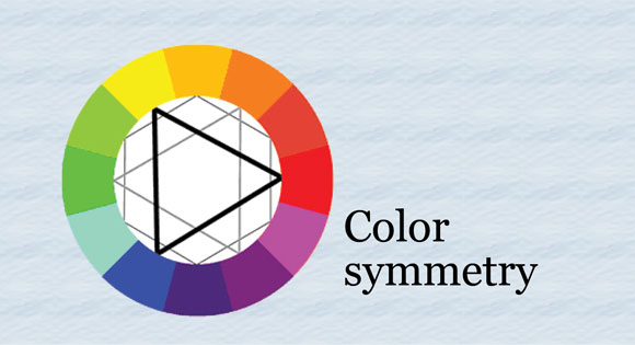
Although most commonly symmetry is a description of shape, it can also refer to color. The color wheel, for example, has a certain symmetry to it. Colors balance across the wheel to their harmonious opposites.
Pair colors in ways that create a sense of balance and harmony to create a sense of symmetry in color. Use this theory of color when creating a color palette to create harmony and symmetry in color, or even chaos and asymmetry.
For additional balance, create symmetrical shapes and mix harmonious colors. The resulting effect will be organized, clean and calming.
Conclusion
Symmetrical design schemes do not fit every project but they are rather simple to create. The theory behind symmetry can help any designer or developer — from novice to advanced — create a design that is balanced, rhythmic and easy on the eye.


